Flare
role
tech stack
date
Flare is an internal app that measure the quality of code repositories and reduce the risk of shipping features.
The problem
No standardized method had been established at the company to promote and maintain engineering best practices. Not only was it crucial to establish a process, but we needed to make this new process fun and engaging to use for engineers across multiple teams, in various offices. This would be challenging given the need to maintain visibility on important data for each team.
All work, but no play? No way!
Gamifying this process quickly became the goal. We needed to:
Measure repository quality based on specific company policies
Show actionable ways improve in those areas
Provide metrics to show progress over time and across all engineering teams
Make it fun! This way, our engineers would be motivated to meet the engineering best practice criteria and continue to use the product in the future

Tell me where it hurts
When I sat down with many managers and engineers from security, platform, and different production teams, my goal was to better understand what made the current situation inefficient, ineffective and even painful at times.
Hearing everyone's stories, I observed some recurring themes: the tools that engineers used were fragmented and out of sync, Slack messages were too ephemeral, and teams encountered barriers for establishing consistent processes for how they worked.
Because of these significant pain points, there was skepticism that we could successfully build something, let alone a useful tool. It was a challenging product to build and we knew there we plenty of challenges ahead of us, but we needed to start somewhere. So I started by focusing on one single element, the score.
Validating the idea
Inspired and hopeful, I wanted to get my team excited about Flare's potential, too. Just like a flash of illuminating light, the name Flare symbolized to me the intent of the product: to give visibility to different corners of the company and to help guide the decisions being made.

A core feature of Flare's MVP was Repository Health. **Repository Health is a way to measure the quality of a code repository based on specific company policies. **It was important to measure how things are currently operating before making any attempts to improve. This approach would also would help garner buy-in from future users of the Flare, while also showing that this project was a worthwhile endeavor.
Defining the schema
My team was already pulling data for various sources such as GitHub, security and continuous integration tools, and in-house deployment tool. With this data, we started defining the GraphQL schema to support the first features we were building in the MVP.
A small team can do wonders
While my team was working on the data layer, I was focused on building solid components that are versatile and adaptive to speed the workflow. I didn't want to sacrifice quality, and I wanted to make the user experience smooth and intuitive.
The Design
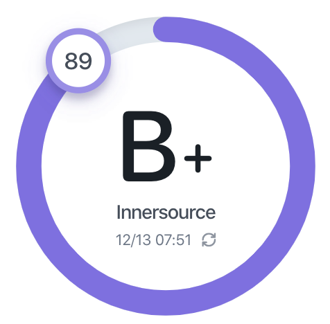
I spent a couple of days prototyping some ideas on how to best visualize the score of a code repository, keeping in mind our goal to gamify this process. When the Score Ring got the most cheers at a team review meeting, I knew I had hit the mark!


Soon, the Score Ring became an iconic part of Flare. Because the useful data and the animated score, the Score Ring was both functional and fun. While the app was growing, I was utilizing the same iconic component in different contexts and sizes that communicated the same type of information.
Painting more pixels
Building score representation and score history
When viewing a code repository page, the Score Panel component shows everything you need to know about the score. After several iterations, I validated the idea and made sure it was easy to scan for most people.
Using the score panel
The bar chart at the bottom of the Score Panel shows score changes based on events that occur on Github, e.g. pull request closed. A user can also recalculate the score when they hit the button inside the Score Ring.
Score panel showing the current score, breakdown of the score policies, and the history.
After a few weeks, I was simultaneously building Flare's design system with the app. I focused on good typography for a strong visual hierarchy. I chose SF Pro Round to use for large numbers and the score letter grade, and SF Mono for version numbers and score pointers that needed mono spacing for improved readability.
Dude, where’s my stuff?
As Flare grew, navigating hundreds of repositories needed to be easy and quick. When thinking about how to best achieve this, it became clear that a global search that could be invoked anywhere in the app with a keyboard shortcut shift + s was needed.
For example, jumping between another repository takes only a couple of seconds:
What am I looking at?
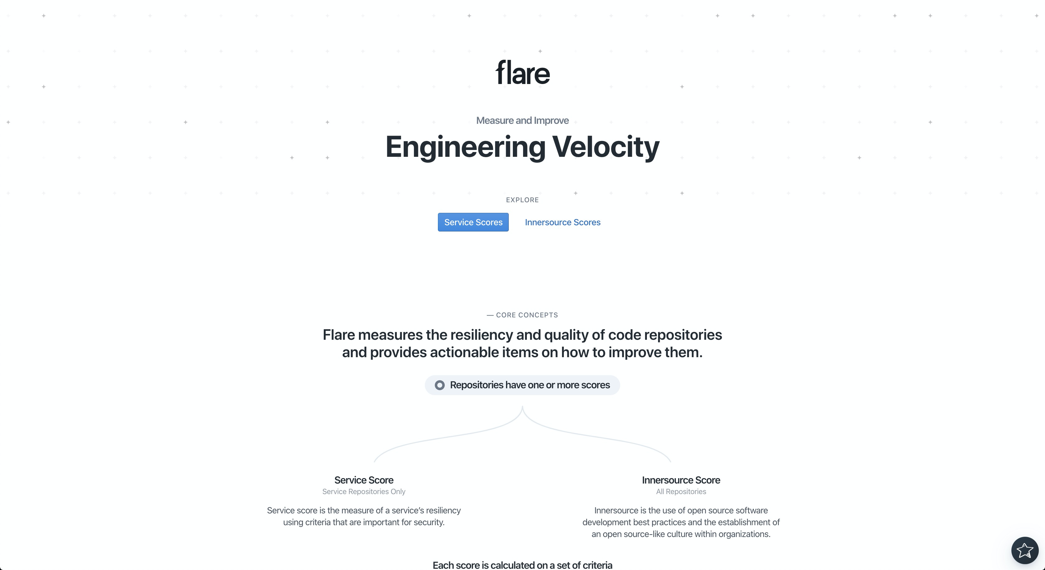
As with all new products, Flare's homepage needed to quickly communicate its purpose, especially to first-time visitors, many whom may not know anything about it at all. By adding an attention-grabbing introduction, followed by a visual and clear description of Flare's core concepts, we quickly oriented users to the product.
Instead of a large wall of paragraphs, I created simple visuals to communicate the story of Flare both quickly and effectively.
Show me the data!
Flare's Overview pages show the distribution of repositories scores, with large virtualized lists that navigate to a specific repository. The Overview pages show the following:
An aggregate of all current scores categorized by value
Top score repositories (which acts as good reference for other teams)
Adoption rate of an important internal tool engineering team uses (there was no analysis on that before Flare)
A heat map to show if scores are improving overtime
A breakdown each of the policies score uses to look up all repositories that pass or fail a particular policy.
Learn once, find everywhere
When building Flare, it was important that everything works intuitively after learning a couple of simple interactions. In addition to learning a couple of interactions, any data point can be selected and it will show the list of repositories that fall in that category or list. Both mangers and non-technical people found it quite straight forward to use.
Browsing the overview page. Each data point can be clicked on to show the list of repositories.
Code quality
Flare was starting to take and get attention from different stakeholders throughout the company. Even as an MVP, and more momentum was building around it, I would take extra care to refactor code as I added new features, whether on the backend or frontend. From the beginning of this project, I communicated to my team that an elegant codebase is as important as the design and functionality of Flare.
The launch
The feedback our team received on Flare was overwhelmingly positive. When Flare was first presented to different managers and directors, some thought the product was purchased. Others couldn't believe it was just an MVP that was built in a couple of months by a small team.
Raising the bar
When building Flare, I knew executives and directors wanted a substantial product, something with great potential for easing pain points across multiple teams throughout the company. That's the reason, when management focused on getting things finished as quickly as possible, I took a stance for quality over speed.
I wanted to establish a new standard at Credit Karma, to raise the bar for the quality of the software we design and build, and the best way to that was to show it.
Despite its challenges, I fought hard and pushed back on ideas that didn't maintain the integrity and attention to detail we envisioned for Flare. I cared about every detail as much as I could. At times, it may feel like the easier way was best, but I encouraged my team to remember that good execution is critical, and all those details will matter in the end. Seeing Flare's success continue to grow kept the team motivated.
What's next?
I'm extremely proud of the output of my efforts on Flare so far, especially given a short timeline of the project and limited resources. As with any great project, there's still a lot of work to be done.
Currently, the team is discussing a new architecture for Flare that is more modular and that would scale effectively across the company. This would create data storage is completely contextual and event-driven. Policies would be its own entity, given an input and a set of rules, would allow or block a particular action.
